Creating a full-stack kanban board: the Vue SPA frontend
This is part 1 of a 2 part series, you can find the second part on creating the Ruby on Rails backend here: the Ruby on Rails API backend
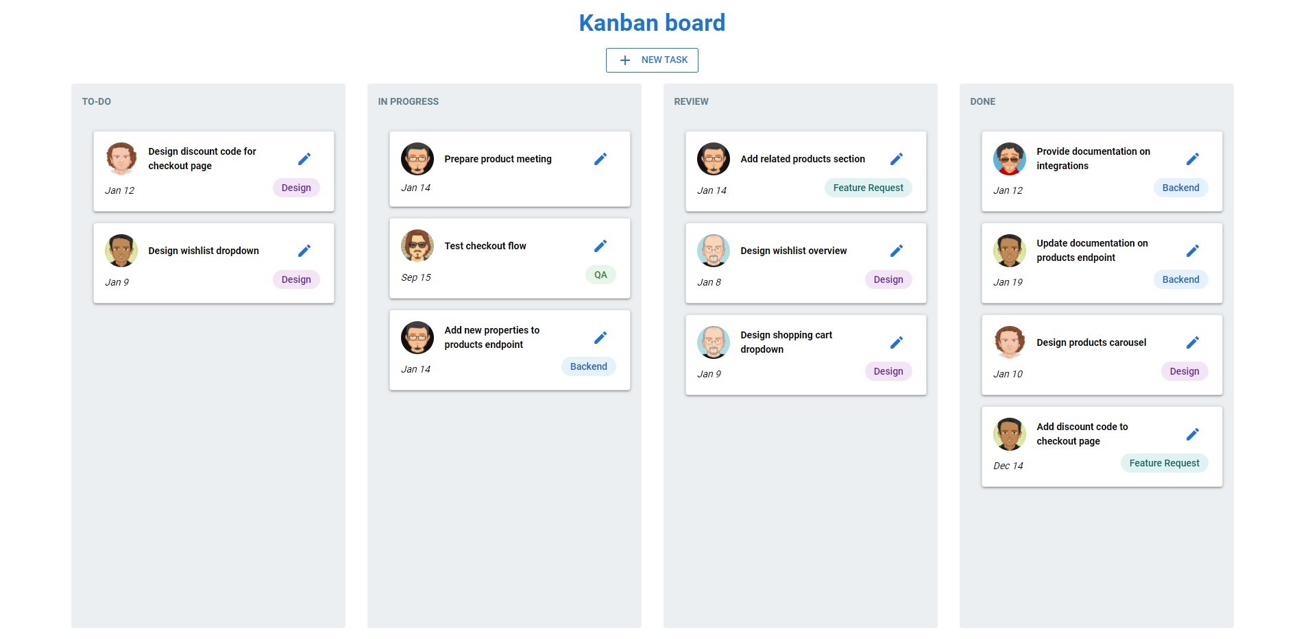
💡 Demo
The app we're creating is a full-stack kanban board where you can manage the cards with all CRUD (i.e. Create, Read, Update, Delete) operations and the cards will automatically update in the database when moving it between different columns.
You can find a demo of it here: Demo Kanban Board
⚙️ Code
The example project's code can be found in these repositories on Github:
Vue frontend: https://github.com/WoetDev/woetflow-demo-kanban-board-vue
Ruby on Rails backend: https://github.com/WoetDev/woetflow-demo-kanban-board-api
1. Creating the Vue app
First thing we’ll do is create our new Vue project. I used this blog post from BinarCode as an inspiration to build the board, but we’re gonna add a couple of important differences to more easily support the CRUD operations and the communication with the API.
We’ll be using the following third-party libraries to build the application:
-
Quasar, for generating the project & use it for the UI components
-
VueDraggable, for supporting the drag-and-drop functionality
-
Axios, for making the API requests
-
Vue-moment, for easy date formatting
1.1 Generating the Quasar project
Quasar is a frontend Vue component library built according to the material design specification. What’s great about Quasar is that it offers a great deal of functionality, styling & helpers out-of-the-box, but it’s still flexible enough to add additional customizations without needing to jump through hoops or straight-up run against a brick wall.
They also have their own CLI which offers a lot of benefits, but for now we’ll only be using it to generate our project.
If this is your first time using Quasar, you can install the CLI by running: yarn global add @quasar/cli
Once installed, we can create the project with the command: quasar create woetflow-demo-kanban-board-vue
Then, we’ll get some questions for the configuration of our app which we’ll answer with the following:
? Project name (internal usage for dev) (leave blank)
? Project product name (must start with letter if building mobile apps) KanbanBoard
? Project description A full-stack kanban board
? Author (leave blank)
? Pick your favorite CSS preprocessor: (can be changed later) Sass with SCSS syntax
? Pick a Quasar components & directives import strategy: (can be changed later) Auto-import in-use Quasar components & directives
? Check the features needed for your project:
ESLint (recommended),
Vuex,
Axios,
IE11 support
? Pick an ESLint preset: Prettier
? Continue to install project dependencies after the project has been created? (recommended) Yes, use Yarn
- TIP: You can leave a space blank by pressing ‘Enter’
After answering everything, let the CLI do its thing and our project is created!
As a last setup, we’ll also add some npm scripts into our package.json so we can use yarn to start our development server and build for production.
package.json:
"scripts": {
    "serve": "quasar dev",
    "build": "quasar build",
    "lint": "eslint --ext .js,.vue ./",
    "test": "echo \"No test specified\" && exit 0"
  },
To test if everything went good we can boot up our development server.
Run: yarn serve
Once compiled, the app should open automatically in a new tab and you should see the Quasar logo in the middle.
1.2 Default code clean-up
Once you’ve confirmed that it’s working, we’ll clean up some of the default code so the following files will look like below.
src/layouts/MainLayout.vue:
<template>
  <q-layout view="lHh Lpr lFf">
    <q-page-container>
      <router-view />
    </q-page-container>
  </q-layout>
</template>
<script>
export default {
  name: 'MainLayout'
}
</script>
src/pages/Index.vue:
<template>
  <q-page class="flex flex-center"> </q-page>
</template>
<script>
export default {
  name: 'PageIndex'
}
</script>
Also, delete the file src/components/EssentialLink.vue
And now we’re set to start building the board.
2. Creating the board and draggable cards
2.1 The Card component
The Card component doesn't contain any other components, so we’ll start by creating this one.
src/components/Card.vue:
<template>
  <q-card bordered class="cursor-move">
    <q-card-section>
      <div class="row items-center">
        <q-avatar>
          <img :src="card.user.value" :alt="card.title" />
        </q-avatar>

        <span class="q-px-md col"><strong>{{ card.title }}</strong></span>
        <q-btn flat class="col-2">
          <q-icon
            name="create"
            size="sm"
            color="primary"
            class="action-button"
          />
        </q-btn>
      </div>

      <div class="row justify-center items-center">
        <span class="col text-italic q-pt-sm"> {{ card.date }} </span>
        <q-chip
          v-if="card.tag"
          :color="`${chipColor}-1`"
          :class="`text-${chipColor}-9 text-weight-medium`"
        >
          {{ card.tag }}
        </q-chip>
      </div>
    </q-card-section>
  </q-card>
</template>
<script>
export default {
  name: "Card",
  props: {
    card: {
      type: Object,
      required: true
    }
  },
  computed: {
    chipColor() {
      const mappings = {
        "Design": "purple",
        "Feature Request": "teal",
        "Backend": "blue",
        "QA": "green",
        'default': "teal"
      };
      return mappings[this.card.tag] || mappings.default;
    }
  }
}
</script>
So what’s going on in this component?
-
Everything that starts with ‘q-’ is a quasar component, and we’ve added some properties and classes to each for styling & alignment.
-
The data that will be shown in this component, will be passed down as a prop from the parent component. So it won’t work for now since we haven’t built the parent component yet.
-
We’ve also added the
chipColor()computed property, each card can optionally have a tag. This computed property is used to determine which color this tag should be.
NOTE: if you’re using VS Code, Vetur might be giving the error “Property 'card' does not exist on type 'CombinedVueInstance<Vue, object, object, object, Record<never, any>>'."
This is caused by a bug in Vetur, so for now we’ll turn this off by setting vetur.experimental.templateInterpolationService to false.
settings.json:
{
  "vetur.validation.template": false,
  "vetur.format.enable": false,
  "eslint.validate": ["javascript", "javascriptreact", "typescript", "vue"],

  "vetur.experimental.templateInterpolationService": false
}
2.2 The Column component
Each card will be placed in a column, so now we’ll create the parent Column component of the cards.
First, we’ll add the VueDraggable package to our app to support the drag-and-drop functionality.
Run: yarn add vuedraggable
Each card will be placed in a column, so now we’ll create the parent Column component of the cards.
First, we’ll add the VueDraggable package to our app to support the drag-and-drop functionality.
Run: yarn add vuedraggable
This will give us access to a new draggable component to wrap around our cards.
For now, we’ll add a couple of cards as static data. But later on we’ll replace this with cards from our Vuex store, which will contain the cards from our database.
src/components/Column.vue:
<template>
  <div class="column q-py-md">
    <div class="c-bg-grey-1 q-pa-md q-mx-md rounded-borders text-blue-grey">
      <b>{{ column.label }}</b>
    </div>

    <draggable
      v-model="cards"
      :animation="200"
      group="all-cards"
      ghost-class="moving-card"
      filter=".action-button"
      class="q-pa-md q-mx-md q-gutter-md c-bg-grey-1 rounded-borders c-column"
    >
      <Card v-for="card in cards" :key="card.id" :card="card" />
    </draggable>
  </div>
</template>
<script>
import Draggable from 'vuedraggable'
import Card from '../components/Card.vue'

export default {
  name: "Column",
  props: {
    column: {
      type: Object,
      required: true
    },
    cards: {
      type: Array,
      required: true
    }
  },
  components: {
    Draggable,
    Card
  }
}
</script>
So what’s going on in this component?
-
Added a cards prop that we’ll be receiving from the parent component so we can already test if our application is working as expected. Later on, we’ll remove this prop and use the data from the Vuex store instead, since this will contain the data from our database.
-
The column data that will be shown will be passed down as the column prop from the parent component. For now, it won’t work since we haven’t built the parent component yet.
-
We’ve imported the Card component we created earlier. We’re using
v-for="card in cards" :key="card.id" :card="card"to render a Card component for each card in the cards prop. We also pass down the information of the card in the current iteration as a prop to the child component. -
We’ve imported the Draggable component and wrapped this around our cards to enable the drag-and-drop functionality. We’ve also added some options to this component to configure how the drag-and-drop will behave:
-
v-model="cards"will contain the list of cards in this column & track if the cards in the column are changing -
:animation="200"will add an animation of 200ms when cards are being dragged in between columns or each other. -
group="all-cards"says that all columns belong to the same group, so this will enable us to drag the cards between different columns -
ghost-class="moving-card"will add the moving-card class to a card so we can customize the styling of a card while it’s being dragged. We’ll be adding this styling in a bit. -
filter=".action-button"will prevent a card from being dragged when a user is clicking the ‘Edit’ button in the Card component.
-
We added some classes from Quasar for styling, but the classes c-bg-grey-1 and c-column are custom ones that we’ll be adding later on.
2.3 The Index page
Now, it’s time to put both of these components together to create our Kanban Board page.
src/pages/Index.vue:
<template>
  <q-page>
    <div class="flex justify-center">
      <div class="text-h4 text-primary q-py-md"><b>Kanban board</b></div>
    </div>

    <div class="flex justify-center">
      <Column v-for="column in columns" :key="column.id" :column="column" />
    </div>
  </q-page>
</template>
<script>
import Column from '../components/Column'

export default {
  name: 'PageIndex',
  data: () => ({
    columns: [
      {
          id: 1,
          label: "TO-DO",
          value: "to_do",
          created_at: "2021-01-26T22:39:27.001Z",
          updated_at: "2021-01-26T22:39:27.001Z",
          cards: []
      },
      {
          id: 2,
          label: "IN PROGRESS",
          value: "in_progress",
          created_at: "2021-01-26T22:39:27.020Z",
          updated_at: "2021-01-26T22:39:27.020Z",
          cards: [
              {
                  id: 38,
                  title: "Add steppers to order process",
                  date: "2021-02-24T00:00:00.000Z",
                  tag: "Backend",
                  created_at: "2021-01-28T22:38:09.601Z",
                  updated_at: "2021-01-29T10:05:56.538Z",
                  user: {
                      id: 4,
                      label: "Vincent Chase",
                      value: "https://pickaface.net/gallery/avatar/Opi51c74f6c56e40.png",
                      created_at: "2021-01-26T22:39:27.067Z",
                      updated_at: "2021-01-26T22:39:27.067Z"
                  },
                  column: {
                      id: 2,
                      label: "IN PROGRESS",
                      value: "in_progress",
                      created_at: "2021-01-26T22:39:27.020Z",
                      updated_at: "2021-01-26T22:39:27.020Z"
                  }
              }
          ]
      },
      {
          id: 3,
          label: "REVIEW",
          value: "review",
          created_at: "2021-01-26T22:39:27.026Z",
          updated_at: "2021-01-26T22:39:27.026Z",
          cards: []
      },
      {
          id: 4,
          label: "DONE",
          value: "done",
          created_at: "2021-01-26T22:39:27.031Z",
          updated_at: "2021-01-26T22:39:27.031Z",
          cards: [
              {
                  id: 21,
                  title: "Add paypal as a payment provider",
                  date: "2021-01-14T00:00:00.000Z",
                  tag: "Feature Request",
                  created_at: "2021-01-27T17:36:23.776Z",
                  updated_at: "2021-01-29T10:06:26.413Z",
                  user: {
                      id: 4,
                      label: "Vincent Chase",
                      value: "https://pickaface.net/gallery/avatar/Opi51c74f6c56e40.png",
                      created_at: "2021-01-26T22:39:27.067Z",
                      updated_at: "2021-01-26T22:39:27.067Z"
                  },
                  column: {
                      id: 4,
                      label: "DONE",
                      value: "done",
                      created_at: "2021-01-26T22:39:27.031Z",
                      updated_at: "2021-01-26T22:39:27.031Z"
                  }
              }
          ]
      }
    ]
  }),
  components: {
    Column
  }
}
</script>
So what’s going on in this page?
-
We imported the Column component to display each column and their cards on the page.
-
We’ve added the columns data property that contains all the information about the columns and its cards. We'll be replacing this static data property later on with the data from our Vuex store, which will hold the data from our database.
2.4 Custom styling of the board and cards
To make everything look and feel better, we’ll add a couple of custom styling rules.
We’re gonna keep it light with the CSS and only add classes for styling our card when a user is dragging it, change the cursor when hovering over a card and give our columns a min-height and background so the cards are easier to drag between the columns.
src/css/app.scss:
// Override defaults
body {
  background: white;
}

// Helpers
.cursor-move {
  cursor: move;
}

.c-bg-grey-1 {
  background: $blue-grey-1;
}

.c-column {
  min-height: 80vh;
  max-width: 95vw;
  width: 400px;
}

// Dynamic classes
.moving-card {
  opacity: 0.5;
  background: $blue-grey-1;
  border: 1px solid $blue-5;
}
2.5 Formatting the date
As a final step before we’ll go and test the application we’ve built so far, we’ll format the date that appears on the card. Right now, the dates on the cards will appear in the ISO-8601 format (e.g. 2021-02-24T00:00:00.000Z) which computers love reading, humans however, not so much…
So we’ll add the vue-moment package to our app which makes it very easy to change date formats if you provide it with an ISO-8601 string.
Run: yarn add vue-moment
In a Vue CLI app, you normally have the main.js file as the entry point of your app where you can add the dependencies of third-party libraries such as vue-moment.
In a Quasar CLI app, you don’t have this file anymore and such third-party libraries must be added using boot files. Luckily, the level of simplicity is the same and it’s easier to keep an overview once you start adding more dependencies.
Run: quasar new boot moment
This command will create a new boot file called moment.js.
In this file we’ll add our dependency code and after that we'll add it to the boot array.
src/boot/moment.js:
import Vue from 'vue'
Vue.use(require('vue-moment'));
quasar.conf.js:

…
   boot: [
      'axios',
      'moment'
    ],
...
Once we’ve added the dependency all we still need to do is go back to our Card component and format the date.
src/components/Card.vue:
...
{{ card.date | moment("MMM D") }}
...
2.6 Testing our application
Now that we’ve set up the columns and added some cards, let’s check out how our application is looking so far!
Run: yarn serve
Once compiled, your app should have the following:
-
Have 2 cards in the ‘in progress’ column and 1 in the ‘done’ column
-
Be able to drag these cards between each other and move them between columns.
-
Don’t worry if you’re getting this error in the console:
Avoid mutating a prop directly since the value will be overwritten whenever the parent component re-renders.We’ll solve this by removing the cards prop and instead use the data in our Vuex store.
If something is not working as expected, you can find an overview of how the application code should look right now in this commit
3. Adding the CRUD operations and API requests
Now that you’ve got a static working board, let’s make that complete by making it possible to manage all your cards & persist that information to the database through the Ruby on Rails API. Of course, we’ll also need to make sure that everything behaves as expected without needing a single page refresh
Before you start this part of the Vue app, I’d recommend to hop over to the other part and setup the Ruby on Rails API first. Things we’ll be doing in this part will make a lot more sense once you know what the API looks like and then you’ll have a fully working board after this!
But without further ado, let’s get started.
3.1 Adding the columns and cards from the database
To start adding our columns from data in our database, we’ll first remove some of the code based on the static data we won’t be needing anymore.
Remove the cards prop & the data properties section on the index page.
src/pages/Index.vue:
...
<Column v-for="column in columns" :key="column.id" :column="column" :cards="column.cards"  />
 ...
 data: () => ({
    columns: [
      {
        id: 1,
        label: "TO-DO",
        value: "to_do",
        created_at: "2021-01-26T22:39:27.001Z",
        updated_at: "2021-01-26T22:39:27.001Z",
        cards: []
      },
    ...
    ]
  }),
...
Also remove this cards prop from the Column component.
src/components/Column.vue:
...
cards: {
  type: Array,
   required: true
}
...
So now that this code is removed, let’s re-add the columns from our database.
To do that, we’ll send an HTTP request to our API and keep track of the columns and their associated cards in the Vuex store. Using the Vuex store to keep track of the cards within the columns makes it a lot easier to keep this data in-sync across all the components.
We’ll start off by creating a new api.js file where we’ll export the functions of our API requests and set the base settings for all requests.
src/api.js:
import axios from 'axios'

const API_URL = process.env.API_URL || 'http://localhost:3000'

const axiosInstance = axios.create({
  baseURL: API_URL,
  headers: {
    'Content-Type': 'application/json',
  },
})

export default {
  getColumns() {
    return axiosInstance.get('/columns')
  },
  getUsers() {
    return axiosInstance.get('/users')
  },
  getCards() {
    return axiosInstance.get('/cards')
  },
  createCard(card) {
    return axiosInstance.post('/cards', card)
  },
  updateCard(card) {
    return axiosInstance.patch(`/cards/${card.id}`, card)
  },
  deleteCard(id) {
    return axiosInstance.delete(`/cards/${id}`)
  },
}
These are gonna be all the API requests we need to build and manage our board.
We also added the base settings for our API requests; in development all requests will be to localhost:3000 and for production we can set the environment variable API_URL to whatever domain our API is hosted on for production.
To learn more about environment variables in Vue, you can refer to the official documentation. However, since we're using Quasar environment variables are handled differently and they're added in the quasar.conf.js file instead of separate .env files.
Now let’s setup our Vuex store where we’ll save the data from the reponses we receive from the API.
src/store/index.js:
import Vue from 'vue'
import Vuex from 'vuex'

Vue.use(Vuex)

export default function () {
  const Store = new Vuex.Store({
    state: {
      columns: [],
    },
    getters: {},
    mutations: {
      setColumns(state, columns) {
        state.columns = columns
      },
      updateColumns(state, { column_id, cards }) {
        let column = state.columns.find((column) => column.id === column_id)
        column.cards = cards
      },
    },
    actions: {},
    modules: {},

    // enable strict mode (adds overhead!)
    // for dev mode only
    strict: process.env.DEBUGGING,
  })

  return Store
}
In the store, we added an empty columns array to the state. This will initially always be empty but we’ll update the columns state with the setColumns mutation after we’ve received the JSON response from our API.
When a user is dragging cards between different columns, then we’ll use the updateColumns mutation to update our columns state.
With those things setup, let’s hop back to our Index page.
On the Index page, we’ll add a new computed property for the columns that will contain the current state of the columns in our Vuex store.
src/pages/Index.vue:
...
<script>
import api from '../api'
import Column from '../components/Column'

export default {
  name: 'PageIndex',
  components: {
    Column
  },
  computed: {
    columns: {
      get() {
        return this.$store.state.columns
      }
    }
  },
  created() {
    api.getColumns()
      .then(response => {
        this.$store.commit("setColumns", response.data)
      })
      .catch(error => console.log(error))
  }
}
</script>
We’re going to update the initial columns state in the created() method, this will get called as soon as the Index page is created for rendering. This uses the api.getColumns() function we created in api.js. Once we’ve successfully received a JSON response from our API, we’ll commit the setColumns mutation to update the columns state in our store.
Finally, the only step we still need to do is to update our Column component to get the columns working correctly.
src/components/Column.vue:
...
<script>
import Draggable from 'vuedraggable'
import Card from '../components/Card.vue'

export default {
  name: "Column",
  props: {
    column: {
      type: Object,
      required: true
    }
  },
  components: {
    Draggable,
    Card
  },
  computed: {
    cards: {
      get() {
        return this.$store.state.columns.find(column => column.id === this.column.id).cards
      },
      set(cards) {
        let column_id = this.column.id
        this.$store.commit("updateColumns", { column_id, cards })
      }
    }
  }
}
</script>
In the file we added a new computed setter for the cards.
This is why it’s also important to extract the Column markup into a separate component. This enabled us to track the state of the cards for each individual column using v-model in the draggable component. This way we can use the computed setter to commit the mutation to update the columns state in the store once the user drags the card to a different position.
3.2 Add a new card
To add a new card, we’ll let the user manage the card information from a modal. We’ll create the button to popup the modal and the modal itself in a new component.
But first, let’s update our Vuex store to have the state properties and mutations we need to support creating a new card.
src/store/index.js:
export default function () {
  const Store = new Vuex.Store({
    state: {
      columns: [],
      users: [],
      cardEditor: {},
      manageCardDialog: false
    },
    getters: {},
    mutations: {
      ...
      setUsers(state, users) {
        state.users = users
      },
      setManageCardDialog(state, manageCardDialog) {
        state.manageCardDialog = manageCardDialog
      },
      setCardEditor(state, card) {
        state.cardEditor = Object.assign({}, state.cardEditor, card);
        state.manageCardDialog = true
      },
      clearCardEditor(state) {
        state.cardEditor = {}
      }
    },
    ...
  })

  return Store
}
So what did we add to the store?
-
The users property will hold the list of all the users that can be associated with a card. We also added the setUsers mutation that will update the users state once we’ve received this information from our API.
-
The cardEditor property will hold the information of the card that is currently shown in the editor. We also added two mutations to handle this information.
-
The setCardEditor mutation will create a new object by merging the properties of the current cardEditor state and overwrite any new card properties that we will pass in the parameters. It will then assign the cardEditor state to this newly created object.
-
The clearCardEditor mutation we’ll use to ensure that the cardEditor object is blank.
-
The manageCardDialog property we’ll use to more easily show or hide the modal across components. We added the setManageCardDialog mutation where we’ll pass a boolean as a parameter to show or hide the modal.
-
The addCard mutation we’ll use to update our store when the user has created a new card. This mutation will add the newly created card to the column.
Now that we’ve updated our store, let’s go and create our new component.
src/components/ManageCard.vue:
<template>
  <div>
    <q-btn
      label="New task"
      color="primary"
      icon="add"
      outline
      @click="onCreate"
    />

    <q-dialog v-model="manageCardDialog">
      <q-card style="width: 700px; max-width: 80vw;" class="q-pa-lg">
        <q-card-section>
          <div class="text-h6 q-pb-md">CREATE TASK</div>
          <q-form @submit="onSubmit" @reset="onReset" class="q-gutter-md">
            <q-input
              outlined
              v-model="title"
              label="Task description *"
              lazy-rules
              :rules="[ val => val && val.length > 0 || 'Please type something']"
            />

            <q-select
              outlined
              v-model="avatar"
              :options="users"
              label="User *"
              @filter="showUsers"
              lazy-rules
              :rules="[ val => val || 'Please select someone']"
            >
              <template v-slot:before>
                <q-avatar>
                  <img
                    :src="avatar != null ? avatar.value : 'https://pickaface.net/gallery/avatar/unr_julande_210111_1628_32cw8.png'"
                  />
                </q-avatar>
              </template>

              <template v-slot:no-option>
                <q-item>
                  <q-item-section class="text-grey">
                    No results
                  </q-item-section>
                </q-item>
              </template>
            </q-select>

            <q-select
              outlined
              v-model="status"
              :options="columns"
              label="Status *"
              lazy-rules
              :rules="[ val => val || 'Please select something']"
            />

            <q-input
              type="date"
              outlined
              v-model="date"
              :stack-label="true"
              label="Date *"
              lazy-rules
              :rules="[ val => val && val.length > 0 || 'Please choose a date']"
            />

            <q-select
              label="Tag"
              outlined
              v-model="tag"
              :options="tags"
            ></q-select>

            <q-card-actions class="flex">
              <div class="col">
                <q-btn label="Submit" type="submit" color="primary" />
                <q-btn
                  label="Reset"
                  type="reset"
                  color="primary"
                  class="q-ml-sm"
                  flat
                />
                <q-btn
                  label="Cancel"
                  color="negative"
                  flat
                  v-close-popup="manageCardDialog"
                />
              </div>
            </q-card-actions>
          </q-form>
        </q-card-section>
      </q-card>
    </q-dialog>
  </div>
</template>
<script>
import { mapState } from "vuex"
import api from "../api"

export default {
  name: "ManageCard",
  data: () => ({
    tags: ["Design","Feature Request", "Backend", "QA"]
  }),
  computed: {
    columns() {
      return this.$store.state.columns
    },
    users: {
      set(users) {
        this.$store.commit("setUsers", users)
      },
      get() {
         return this.$store.state.users
      }
    },
    manageCardDialog: {
      set(manageCardDialog) {
        this.$store.commit("setManageCardDialog", manageCardDialog)
      },
      get() {
        return this.$store.state.manageCardDialog
      }
    },
    ...mapState(["cardEditor"]),
    id: {
      get() {
        return this.cardEditor.id
      }
    },
    title: {
      set(title) {
        this.$store.commit("setCardEditor", { title });
      },
      get() {
        return this.cardEditor.title
      }
    },
    avatar: {
      set(avatar) {
        this.$store.commit("setCardEditor", { avatar });
      },
      get() {
        return this.cardEditor.avatar
      }
    },
    status: {
      set(status) {
        this.$store.commit("setCardEditor", { status });
      },
      get() {
        return this.cardEditor.status
      }
    },
    date: {
      set(date) {
        this.$store.commit("setCardEditor", { date });
      },
      get() {
        return this.cardEditor.date
      }
    },
    tag: {
      set(tag) {
        this.$store.commit("setCardEditor", { tag });
      },
      get() {
        return this.cardEditor.tag
      }
    }
  },
  methods: {
    showUsers(val, update, abort) {
      if(this.users && this.users.length === 0) {
        api.getUsers()
          .then(response => {
            const users = response.data
            update(() => {
              this.users = users
            })
          })
          .catch(error => console.log(error))
      }
      else {
        update()
        return
      }
    },
    onReset () {
      this.title = null
      this.avatar = null
      this.status = null
      this.date = null
      this.tag = null
    },
    onSubmit() {
      const card = {
        title: this.title,
        date: this.date,
        tag: this.tag,
        column_id: this.status.id,
        user_id: this.avatar.id
      }

      api.createCard(card)
        .then(response => {
          this.$store.commit("addCard", response.data);
          this.$store.commit("clearCardEditor")
        })
        .catch(error => console.log(error))

      this.$store.commit("setManageCardDialog", false)
    },
    onCreate() {
      this.$store.commit("clearCardEditor")
      this.$store.commit("setManageCardDialog", true)
    }
  },
}
</script>
So what’s going on in this component?
-
We’ve added a button to create a ‘New task’ which will call the onCreate method. All the onCreate method does is make sure the cardEditor state is blank and show the modal.
-
We’ve added inputs for the title, avatar (i.e. user), status (i.e. column), date and tag of the card. Each input also has validation if it’s required along with its computed setter so we can keep track of the input state in the store. We’re also lazy loading the list of users from our database once the user expands the avatar select input with the showUsers method.
-
We’ve added a reset button, this will call the onReset method which just makes everything in the editor blank again.
-
We’ve added the submit button, this will add the information from our inputs to a new object and persist this information to the database with an API request. Once we’ve received a response that the card is successfully created, we’ll update our columns state in the store with the newly created card, clear the cardEditor state and close the modal.
Now the last thing we need to do is import the ManageCard component into our Index page.
src/pages/Index.vue:
<template>
  <q-page>
    <div class="flex justify-center">
      <div class="text-h4 text-primary q-py-md"><b>Kanban board</b></div>
    </div>

    <div class="flex justify-center">
      <ManageCard />
    </div>

    <div class="flex justify-center">
      <Column v-for="column in columns" :key="column.id" :column="column" />
    </div>
  </q-page>
</template>
<script>
import api from '../api'
import Column from '../components/Column'
import ManageCard from '../components/ManageCard'

export default {
  name: 'PageIndex',
  components: {
    Column,
    ManageCard
  },
   ...
}
</script>
3.3 Update an existing card
To update existing cards, we’ll also need to make a couple of adjustments to the store, Index page, Card and ManageCard components.
We’ll start off with updating the Card component and adding a method to open the ManageCard modal and pre-fill all the inputs with the data from that card.
src/components/Card.vue:
<template>
  ...
  <span class="q-px-md col"><strong>{{ card.title }}</strong></span>
  <q-btn flat class="col-2" @click="onEdit(card)">
    <q-icon name="create" size="sm" color="primary" class="action-button" />
  </q-btn>
  ...
</template>
<script>
export default {
  name: "Card",
  ...
  methods: {
    onEdit(card) {
      const cardProperties = {
        avatar: { label: card.user.label, value: card.user.value },
        status: { label: card.column.label, value: card.column.value },
        date: this.$moment(card.date).format("YYYY-MM-DD"),
        user_id: card.user.id,
        column_id: card.column.id
      }

      const cardEditor = Object.assign({}, card, cardProperties)

      this.$store.commit("setCardEditor", cardEditor)
      this.$store.commit("setManageCardDialog", true)
    }
  }
}
</script>
So we added the new onEdit method, this will add the avatar and status properties to our card, because these are selects we need to give both the label and value to make this work correctly. We’re also adding the date in the format that the date input is expecting it.
We assign the new properties to the new cardEditor variable and merge it with the already existing properties like the id. We then commit this new variable with the setCardEditor mutation to update the cardEditor state in the store.
Then we’ll go to our store and add a new mutation.
src/store/index.js:
export default function () {
  const Store = new Vuex.Store({
    ...
      updateCard(state, card) {
        state.columns.map(column => {
          let cards = column.cards
          let updatedCard = column.id === card.column.id ? card : null
          let cardIndex = cards.findIndex(i_card => i_card.id === card.id) > -1 ? cards.findIndex(i_card => i_card.id === card.id) : cards.length
          updatedCard ? cards.splice(cardIndex, 1, card) : cards.splice(cardIndex, 1)
        })
      }
    ...
}
The updateCard mutation we’ll commit to update the cards in the columns once we’ve received a successful response from the API.
Lastly, we’ll update our ManageCard component to support this.
src/components/ManageCard.vue:
<template>
  <div>
    <q-btn
      label="New task"
      color="primary"
      icon="add"
      outline
      @click="onCreate"
    />

    <q-dialog v-model="manageCardDialog">
      <q-card style="width: 700px; max-width: 80vw;" class="q-pa-lg">
        <q-card-section>
          <div class="text-h6 q-pb-md">
            <span v-if="cardEditor.id">UPDATE</span>
            <span v-else>CREATE</span>
            TASK
          </div>
          ...
        </q-card-section>
      </q-card>
    </q-dialog>
  </div>
</template>
<script>
import { mapState } from "vuex"
import api from "../api"

export default {
  ...
    onSubmit() {
      if(this.cardEditor.id == null) {
        const card = {
          title: this.title,
          date: this.date,
          tag: this.tag,
          column_id: this.status.id,
          user_id: this.avatar.id
        }

        api.createCard(card)
          .then(response => {
            this.$store.commit("addCard", response.data);
            this.$store.commit("clearCardEditor")
          })
          .catch(error => console.log(error))
      }

      else {
        const card = {
          id: this.id,
          title: this.title,
          date: this.date,
          tag: this.tag,
          column_id: this.status.id,
          user_id: this.avatar.id
        }

        api.updateCard(card)
          .then(response => {
            this.$store.commit("updateCard", response.data);
            this.$store.commit("clearCardEditor")
          })
          .catch(error => console.log(error))
      }

      this.$store.commit("setManageCardDialog", false)
    },
    ...
  },
}
</script>
So what did we add here?
-
We’re checking the presence of an id to determine if the user is updating a card or creating a new one.
-
Based on its presence, we change the title of the modal to display “CREATE TASK" or “UPDATE TASK".
-
We also use this approach in the onSubmit method to determine if we should be sending a PATCH or POST request to our API and which mutations to commit.
3.4 Delete an existing card
With almost everything already setup, we just need a couple minor adjustments to support deleting cards.
We’ll again start by adding a new mutation to the store.
src/store/index.js:
export default function () {
  const Store = new Vuex.Store({
    ...
      removeCard(state, card)  {
        let column = state.columns.find(column => column.id === card.column.id)
        let cards = column.cards
        cards.splice(cards.findIndex(i_card => i_card.id === card.id), 1)
      }
    },
    ...
}
This mutation will simply look up the card in the column and remove it.
Now back to the ManageCard component to add the button and method to delete the card in our database with an API request and commit this mutation.
src/components/ManageCard.vue:
<template>
  ...
  <q-card-actions class="flex">
    <div class="col">
      <q-btn label="Submit" type="submit" color="primary" />
      <q-btn label="Reset" type="reset" color="primary" class="q-ml-sm" flat />
      <q-btn
        label="Cancel"
        color="negative"
        flat
        v-close-popup="manageCardDialog"
      />
    </div>
    <q-btn
      v-if="cardEditor.id"
      label="Delete"
      color="negative"
      @click="onDelete(cardEditor)"
    />
  </q-card-actions>
  ...
</template>
<script>
import { mapState } from "vuex"
import api from "../api"

export default {
  ...
    onDelete(card) {
      api.deleteCard(card.id)
        .then(
          this.$store.commit("setManageCardDialog", false),
          this.$store.commit("removeCard", card)
        )
        .catch(error => console.log(error))
    }
  ...
}
</script>
So we check on the presence of an id again to determine if we should display the delete button. When clicked, the delete button will perform an API request to remove this card from the database. If we receive a successful response, then we’ll also commit the mutation to remove this card from the column and close the modal.
3.5 Update card positions
We’ve finally arrived at the last thing we need to do to have our finished kanban board.
A user can already update a card and change its column in the modal, but if a user changes a card’s column by dragging it to another one this won’t be persisted to the database yet.
To make this possible, we’ll need to track when the cards in a column change and persist this to our database accordingly.
We already have the mutation updateColumns that updates the cards in the columns when dragging them, but we’ll also need to add a new mutation that will update a card’s status input when dragged to another column.
src/store/index.js:
export default function () {
  const Store = new Vuex.Store({
    ...
      updatePosition(state, updatedCard) {
        let updatedColumn = state.columns.find(i_column => i_column.id === updatedCard.column.id)
        let cardIndex = updatedColumn.cards.findIndex(i_card => i_card.id === updatedCard.id)
        updatedColumn.cards.splice(cardIndex, 1, updatedCard)
      }
    },
    ...
}
All we need to do now is track the change event in our Column component and make this trigger an event to update the database and commit this new mutation.
src/components/Column.vue:
<template>
  ...

  <draggable
    v-model="cards"
    :animation="200"
    group="all-cards"
    ghost-class="moving-card"
    filter=".action-button"
    class="q-pa-md q-mx-md q-gutter-md c-bg-grey-1 rounded-borders c-column"
    @change="changed($event, column)"
  >
    <Card v-for="card in cards" :key="card.id" :card="card" />
  </draggable>
  ...
</template>
<script>
import api from '../api'
import Draggable from 'vuedraggable'
import Card from '../components/Card.vue'

export default {
 ...
  methods: {
    changed(e, column) {
      if(e && e.added) {
        const updatedCard = {
          id: e.added.element.id,
          column_id: column.id
        }
        api.updateCard(updatedCard)
          .then(response => {
            const card = response.data
            this.$store.commit("updatePosition", card)
          })
          .catch(error => console.log(error))
      }
    }
  }
}
</script>
And that should be it!
3.6 Testing our application
Awesome! You’ve now built a full-stack kanban board. But before we start celebrating let’s test everything out to confirm if it’s working.
So let’s boot up the application.
Run: yarn serve
In your Ruby on Rails API root directory, run: rails s
Once everything is running, you should see something similar to the following:
-
All columns are created and filled with cards from the database.
-
You can add new cards with the “NEW TASK" button
-
You can also edit and delete cards when clicking the pen icon on the card.
-
When dragging cards to different columns, the status of the card is correctly being updated when editing it.
-
With all these actions, you should see the HTTP requests being fired in the console and when you refresh the page, everything is still as you left it!
If something is not working as expected, you can find an overview of how the application code should look right now in this commit.